Case Study ✷ 02 of 03
Designing first impressions for Addepar dashboards
Context
Addepar builds tools that help financial businesses make smarter investment decisions. I joined right before the closed beta of our new Dashboards product.
Challenge
How can we make sure the Dashboards product feels easy and approachable from the very first use?
Solution
Craft clear, simple, and supportive product copy to guide users and reduce friction.
The original modal was hard to scan. I simplified the title, replaced jargon ("run period") with clearer language ("time period"), and added a tooltip to reduce confusion and help advisors move forward with confidence.
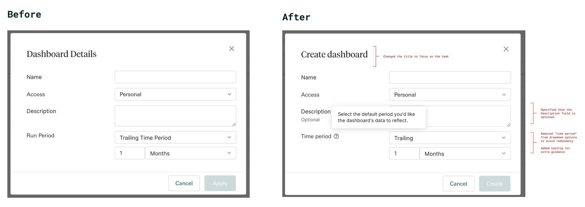
This same audit was applied across every modal, empty state, and settings panel in the product, not just this one example.
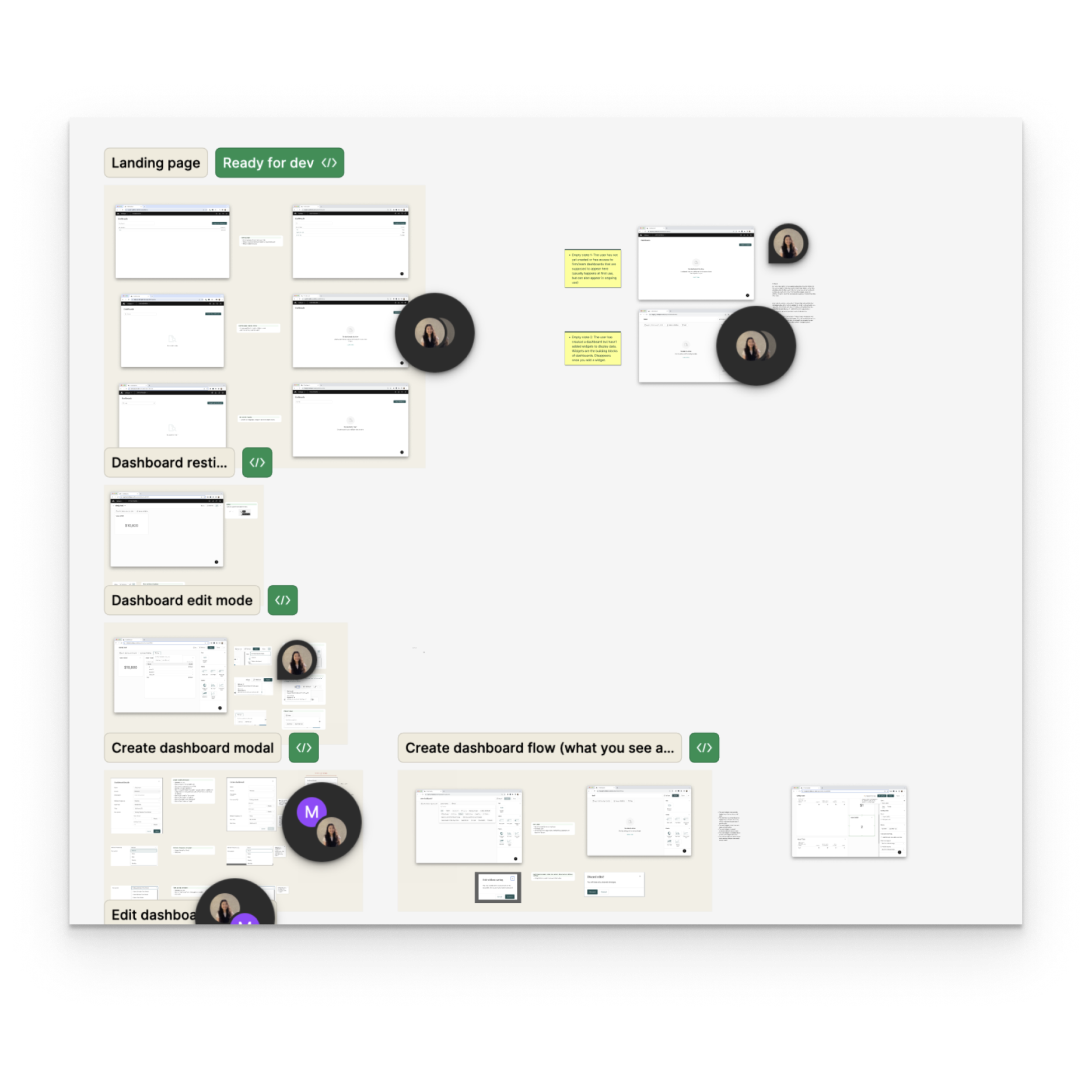
Created empty states as valuable onboarding touchpoints. Aligned content with advisor needs and directed them toward the actions required to generate content.

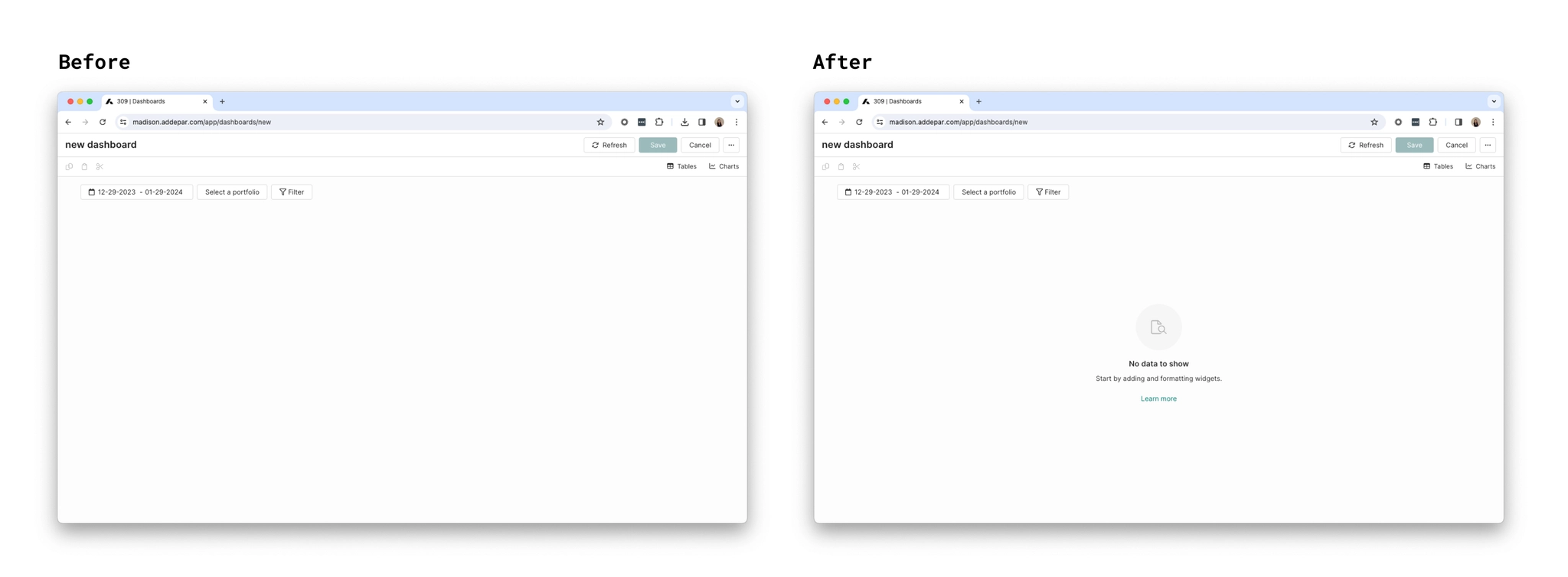
Dashboards use widgets, visualizations such as charts, tables, and key metrics. Because the team hadn't aligned on a name for this object, I facilitated a stakeholder naming workshop to finalize the terminology.
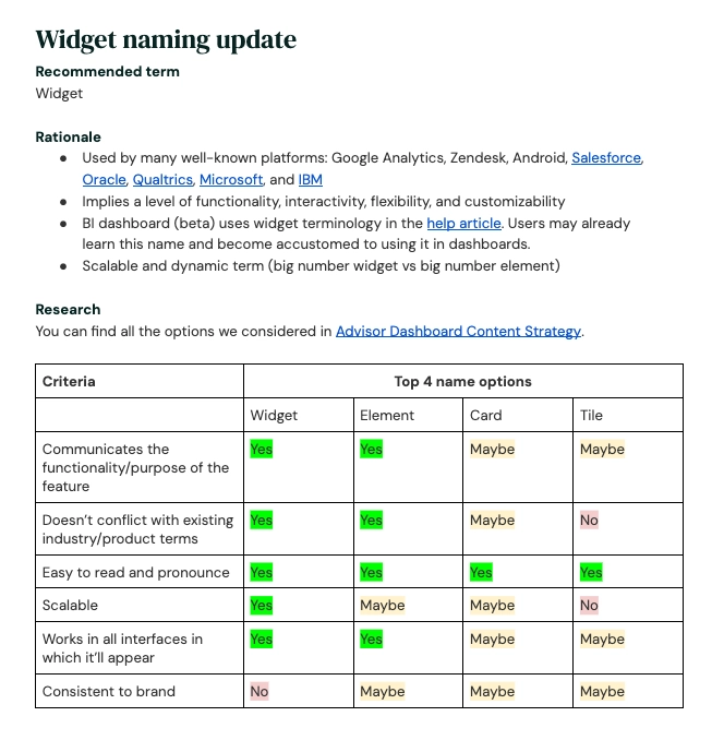
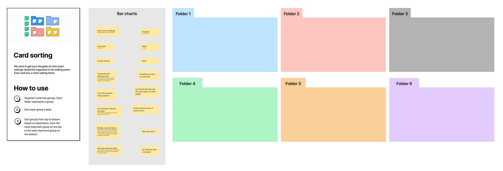
We wanted to figure out how to organize settings in the edit panel. I ran card sorting workshops with different firms to see how financial advisors would group these settings. Advisors consistently sorted the settings into two groups: data and format. But they couldn't understand or sort calculation related settings. We brought this insight to the Calculations team. While updating those settings wasn't part of this project, it's now on our roadmap.
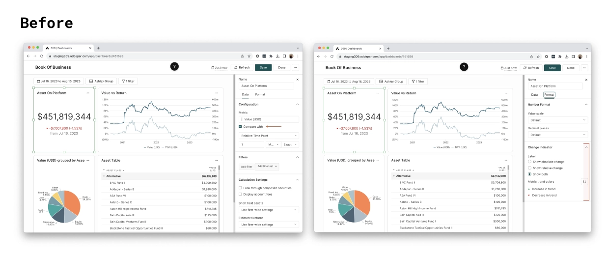
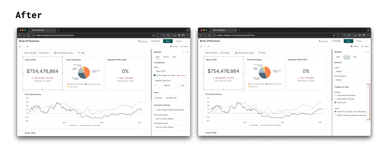
Number widgets surface a single data point, such as a firm's total AUM, and let advisors compare it to a past value to show how it has changed. My challenge was to name this comparison setting in the fewest words while keeping the meaning clear.
Before
After
Outcome
The Dashboards product is in closed beta with 50 participating firms. Every firm has created at least one dashboard, with an average of three per firm. Feedback has been positive, especially around ease of use and the value it brings to key stakeholders.
"Just got off the phone with Firm 406, our largest SFO in LatAm. They love Dashboards, mentioning it's easy to use and will help the Principal and Investment Committee use Addepar more effectively. They especially liked the 'show change over time' setting in the text widget. FYI: this feature was a key factor in securing a 3-year renewal with a price increase."